ZombieJesus vs. ZombieWizard
WTF is this?
|
|---|
|
|---|
Friday, August 31, 2007
more updates at FV
Labels:
funvampires,
jesus,
wizards,
wtf is this,
zombies
Monday, August 27, 2007
Change of venue
Hello loyal readers,
I have realized that I am no longer able to update to this blog every day, and so I have decided to move to another site which you can all check daily and get new updates, some of which will be mine.
funvampires.com
I just did a best-of-the-worst retrospective and will be making all Awful Tattoos updates to that site from here on out. I'll be posting on here to let you know when the updates are for the first few weeks or so.
Thanks,
Alice
Monday, August 20, 2007
Wizards III: wizards with balls
Here is an assortment of my favorite tattoo theme: wizards with glowing and/or fiery crystal balls.
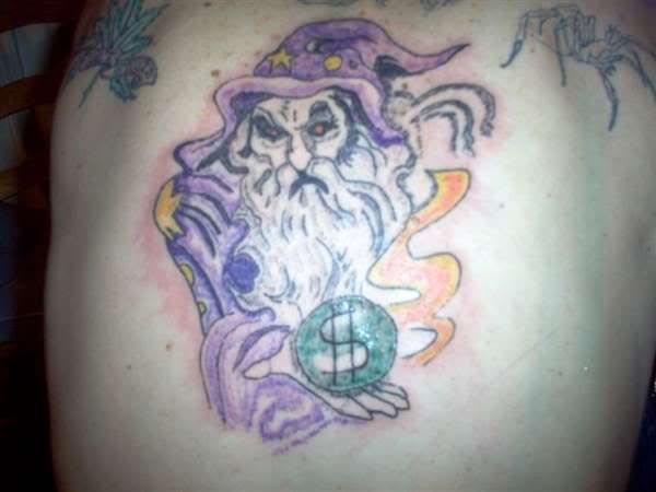
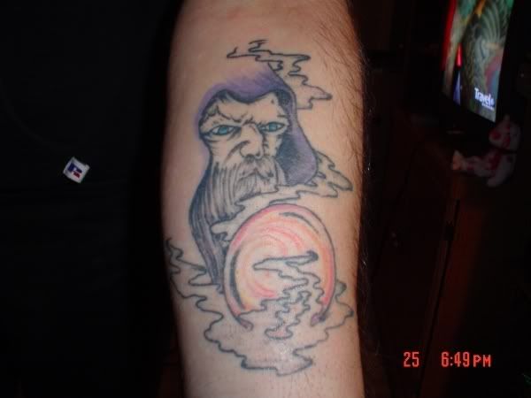
Glowing red eyes just make this wizard look like a snake, and what is up with the weird pointy shoulder on the left? I can't even begin to discuss the money ball...
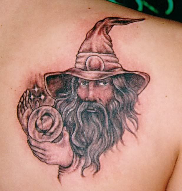
This wizard is the best of the bunch, technique-wise, but what is up with the Q-ball? The sparkles are a good touch.
This guy gets bonus points for having eyes, but negative points for the half-assed glowing ball.
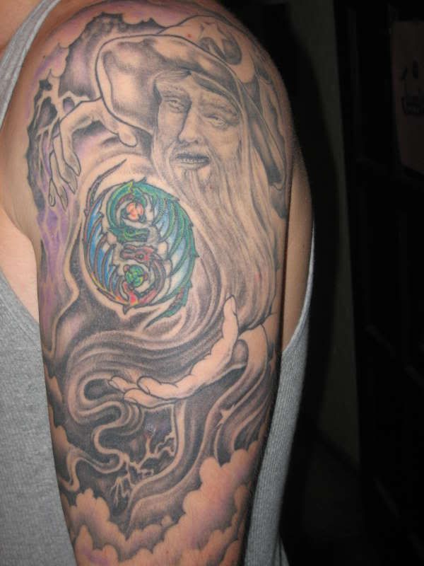
Not only does this wizard look like a zombie with shark teeth, but his magic ball is made out of DRAGONS and he has flying decapitated hands.
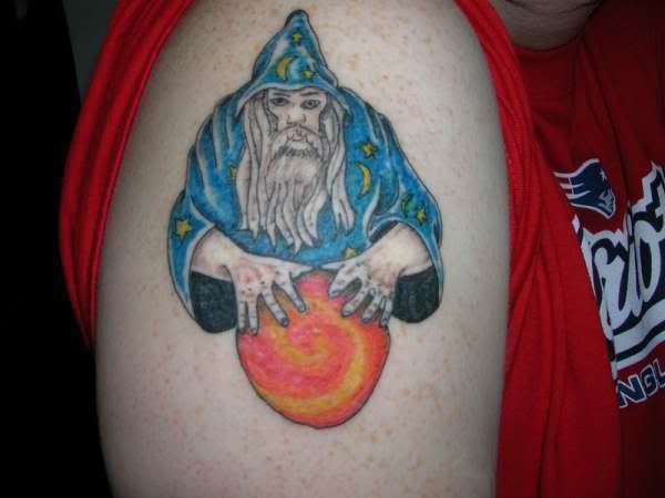
I love the robe but this wizard looks like he's about to hike a football, not cast some serious magic
And finally, I know this bad picture obscures the badness of the tattoo, but just pay close attention to the pointy red fingernails, the snake-eyes, and the fire that looks like it is in zero-g.
Glowing red eyes just make this wizard look like a snake, and what is up with the weird pointy shoulder on the left? I can't even begin to discuss the money ball...

This wizard is the best of the bunch, technique-wise, but what is up with the Q-ball? The sparkles are a good touch.

This guy gets bonus points for having eyes, but negative points for the half-assed glowing ball.

Not only does this wizard look like a zombie with shark teeth, but his magic ball is made out of DRAGONS and he has flying decapitated hands.

I love the robe but this wizard looks like he's about to hike a football, not cast some serious magic

And finally, I know this bad picture obscures the badness of the tattoo, but just pay close attention to the pointy red fingernails, the snake-eyes, and the fire that looks like it is in zero-g.

Tuesday, August 14, 2007
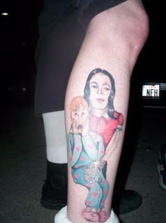
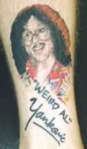
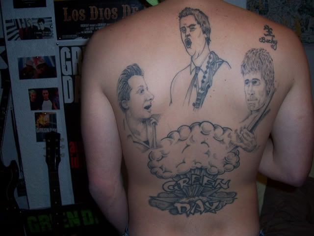
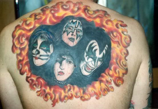
When you really, really love a musician...
It still doesn't mean that getting their portrait tattooed on you is a good idea.


Monday, August 13, 2007
Star Wars II
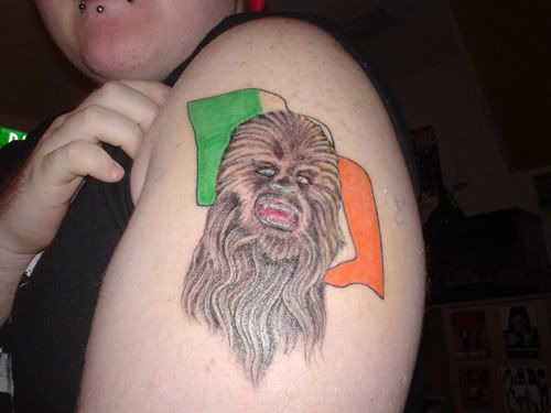
I got this email from a reader in my inbox this morning. Thank you so much! This chewie is amazing!
this is my friend's arm, proudly displaying chewbacca over an Irish
flag... this tattoo came to him in a dream.
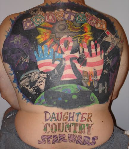
It prompted me to do another search for bad Star Wars tattoos so that I could fill out a post. I already had this one saved. It's an internet classic and one of my favorite awful tattoos:
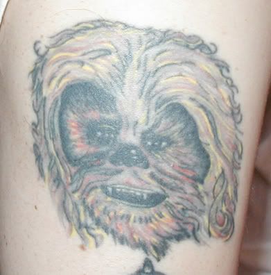
I found a couple other wonky chewies:
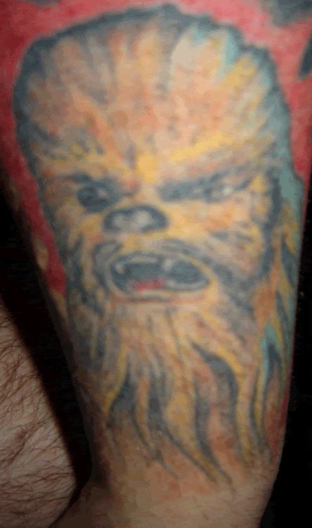
The color shading in this one is pretty funny:
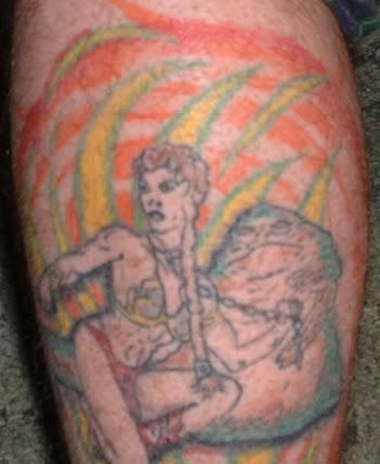
And finally: one of the worst tattoos posted on this blog to date. It's Jabba with slave Leia, in case you can't tell! Her hair is coming out of her face, her six pack is atrocious, her arms and hands look just like her braid of hair, her nose looks alien, and she has the weirdest shoulder I have ever seen. Jabba actually looks pretty decent, but then there's the weird leafy neon background behind them.
this is my friend's arm, proudly displaying chewbacca over an Irish
flag... this tattoo came to him in a dream.

It prompted me to do another search for bad Star Wars tattoos so that I could fill out a post. I already had this one saved. It's an internet classic and one of my favorite awful tattoos:

I found a couple other wonky chewies:

The color shading in this one is pretty funny:

And finally: one of the worst tattoos posted on this blog to date. It's Jabba with slave Leia, in case you can't tell! Her hair is coming out of her face, her six pack is atrocious, her arms and hands look just like her braid of hair, her nose looks alien, and she has the weirdest shoulder I have ever seen. Jabba actually looks pretty decent, but then there's the weird leafy neon background behind them.

Wednesday, August 8, 2007
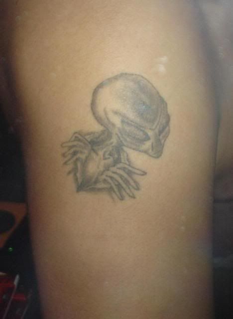
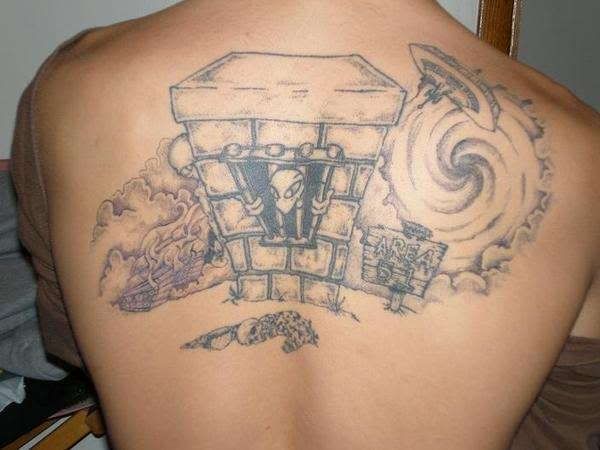
Alien Invasion
Alien tattoos are pretty much always a little cheesy, but these ones are next level:
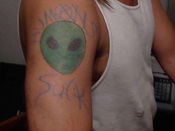
And finally, an internet classic:
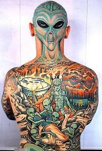


And finally, an internet classic:

Thursday, August 2, 2007
This is for the bike punx
Just a reminder that A) sunscreen is your best friend when you get tattoos, and B) bike tattoos are not always super cool, especially not homemade ones.
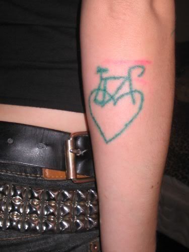
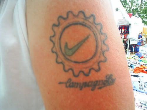
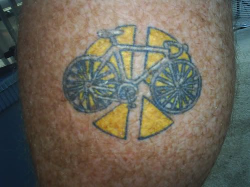
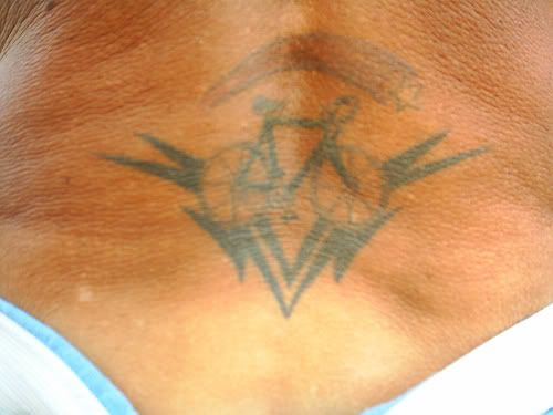
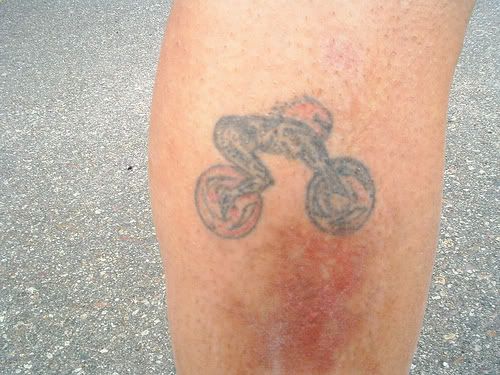
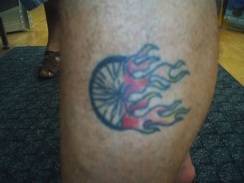
p.s. thanks to the awesome readers who brought these photos to my attention!


p.s. thanks to the awesome readers who brought these photos to my attention!
Tuesday, July 31, 2007
WTF is this?
Yet another edition of the game WTF is this?
Is that spooge on the eyebrow?
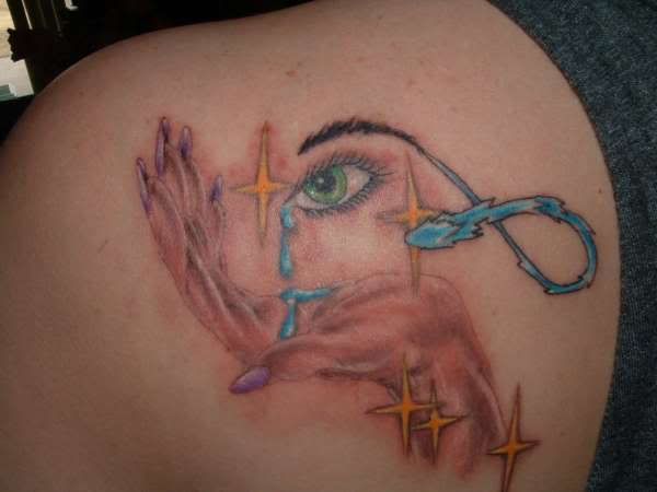
Is that spooge on the eyebrow?

Suns II
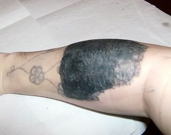
This tattoo is a distant cousin of the last tattoo on this post. It definitely joins the top-10 worst tattoos I've seen so far. I realize both are probably coverups, but when is a huge black, scarred blob better than a scratchy, faded, regrettable tattoo? I think never.
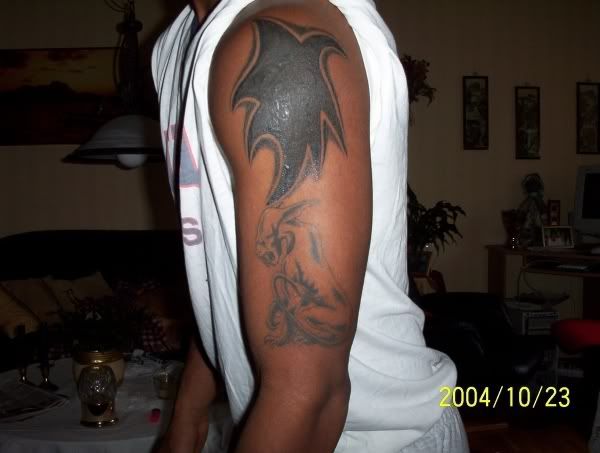
And this one is just generally bad. If it was a wizard at least it would get bonus points for cool idea, but a surly sun-dude is just kind of confusing.
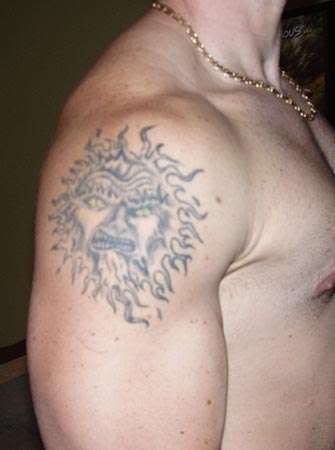

And this one is just generally bad. If it was a wizard at least it would get bonus points for cool idea, but a surly sun-dude is just kind of confusing.

Monday, July 30, 2007
Sorry!
I'm super busy at work now, so this blog will suffer for the next few weeks. Please bear with me.
I haven't known where to post this, so I've been hanging on to it for a while. It seems appropriate for this post. Just sit down, relax, and please be patient.
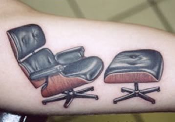
P.S. feel free to email me bad tattoo pictures and save me some of the legwork!
***** EDIT
I got a few comments saying it's a good tattoo. Please note the label for this post is "good execution, bad idea". I will agree that pretty much any tattoo that is executed well isn't truly going to be an AWFUL tattoo, but you have to agree that getting a chair tattooed on you is a little over the top!!!
I haven't known where to post this, so I've been hanging on to it for a while. It seems appropriate for this post. Just sit down, relax, and please be patient.

P.S. feel free to email me bad tattoo pictures and save me some of the legwork!
***** EDIT
I got a few comments saying it's a good tattoo. Please note the label for this post is "good execution, bad idea". I will agree that pretty much any tattoo that is executed well isn't truly going to be an AWFUL tattoo, but you have to agree that getting a chair tattooed on you is a little over the top!!!
Thursday, July 26, 2007
Text tattoos
I am sure there are WAYYY more bad text/ script tattoos out there, but I didn't try to find any of these. They just dropped in my lap as I was searching for other things. One of these days I am going to specifically look for bad text tattoos and I am sure I will find a million of them.
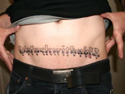
UnfuckwithablE
the funniest part is the capital E at the end. And also the font, which is exactly what I would have chosen when I was 14 and still thought I was goth.
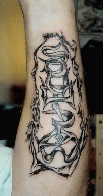
I think the word "SOUTHPAW" is flying out of the guy's skin, but why he would get this tattooed on him I don't know. It's a venue/club in NYC... does it mean anything else? The fact that it has flaps of skin tattooed around it is what puts it into this blog.
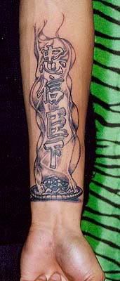
I have no idea what this means (the photo is named "iwillnotbedenied.jpg" so I assume that's what it is), but if they're going to have letters coming up out of the smoke, shouldn't they look like smoke and not block characters?
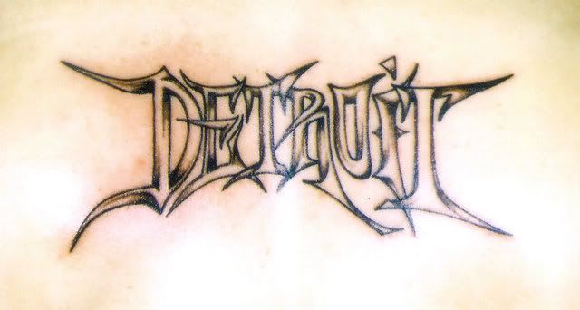
Goth meets Graffiti meets Detroit. I really don't know why I find this so funny.
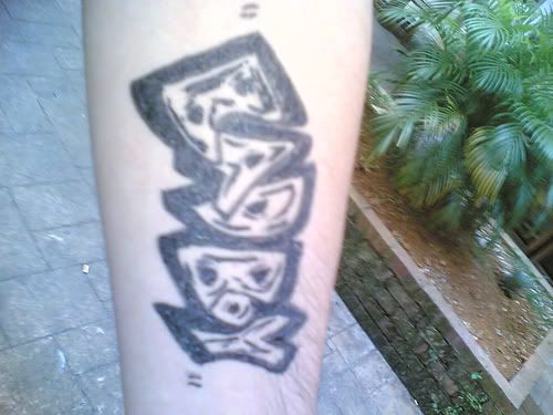
sdkfhsdkfhsdkjfhsdkjfhsdkjfhsdkh!!!!! WHY?????

The best part about this (besides the worst bubble lettering ever) is that it is in quotes. He's not REALLY a bad boy.
UnfuckwithablE
the funniest part is the capital E at the end. And also the font, which is exactly what I would have chosen when I was 14 and still thought I was goth.

I think the word "SOUTHPAW" is flying out of the guy's skin, but why he would get this tattooed on him I don't know. It's a venue/club in NYC... does it mean anything else? The fact that it has flaps of skin tattooed around it is what puts it into this blog.

I have no idea what this means (the photo is named "iwillnotbedenied.jpg" so I assume that's what it is), but if they're going to have letters coming up out of the smoke, shouldn't they look like smoke and not block characters?

Goth meets Graffiti meets Detroit. I really don't know why I find this so funny.

sdkfhsdkfhsdkjfhsdkjfhsdkjfhsdkh!!!!! WHY?????

The best part about this (besides the worst bubble lettering ever) is that it is in quotes. He's not REALLY a bad boy.

Wednesday, July 25, 2007
Some more bad portraits
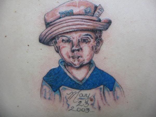
When I first saw this tattoo, I thought the artist was going for a watercolor french impressionist painting style, but then I saw the terrible lettering under the tattoos and realized it's probably the work of a really bad artist.
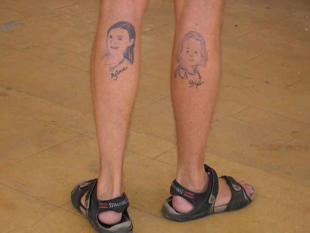
This was pointed out to me by one of my readers. Thanks, Steph!
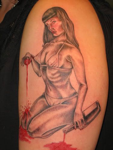
This is the worst Betty Page I have seen. The triangle boobs are a little disturbing, but no big deal. The mushface is terrible but I'd like to think that when the tattoo heals it will look better. What is inexcusable, however, is the arms and hands. Especially the right arm. She looks like a T-Rex on one side. Plus she has major camel toe in the armpit area.
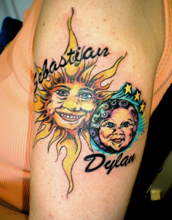
And finally... this isn't so much incompetent as ridiculous. The moon baby is kinda cute, but the sun has the biggest nose in the universe and shark teeth. At least the script is done really well.

This was pointed out to me by one of my readers. Thanks, Steph!

This is the worst Betty Page I have seen. The triangle boobs are a little disturbing, but no big deal. The mushface is terrible but I'd like to think that when the tattoo heals it will look better. What is inexcusable, however, is the arms and hands. Especially the right arm. She looks like a T-Rex on one side. Plus she has major camel toe in the armpit area.

And finally... this isn't so much incompetent as ridiculous. The moon baby is kinda cute, but the sun has the biggest nose in the universe and shark teeth. At least the script is done really well.

The worst tattoo I have ever seen
Words cannot describe how terrible this is. What were they thinking?!

07/24/07 never forget
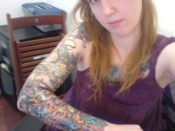
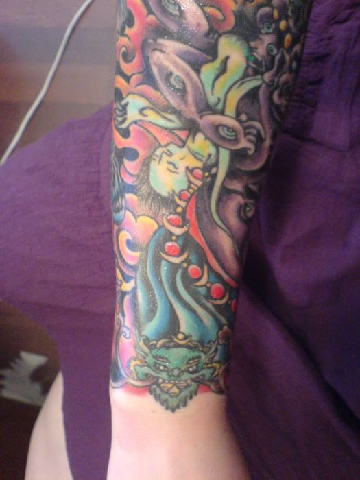
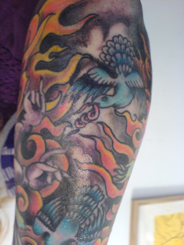
Yesterday was a very special day for me. My right sleeve is finished, after two years of working on it! My tattoo artist is Myles Karr, his website is gloriousdeep.com and he is amazing. We figured out that it has been about 50 hours of work overall. I love that it is so busy and crowded, it's like the awesome old fantasy/ biker tattoos I've been posting, but rad.
Anyway, here are some crappy cellphone pictures that I took this morning, and then some old pictures of the half sleeve. I'll try and get some better ones soon.
Here's one with my whole sleeve so you can get the general idea of how awesome the whole thing is together.
Close up of the protector demon
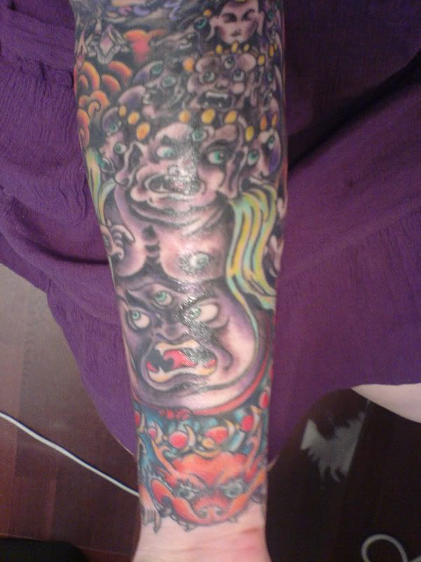
This is my favorite part of the tattoo-- where all the sections come together. The blue and yellow guy is flayed human skin turned into a cape.
Shiny closeup of the birds. The one you can see has intestines in it's mouth. The other one has a heart in it's mouth.
and old pictures of the top half of the sleeve (some with the dragon, some unfinished & without):
one
two
three
four
I really need to take pictures of the whole arm piece by piece so the whole thing is documented correctly, but I need a friend with an awesome camera to help out with that, so it might be a while!
Anyway, sorry for the break from awful tattoos, I will get right on to posting some terrible ones for you shortly.
xo
Alice
Anyway, here are some crappy cellphone pictures that I took this morning, and then some old pictures of the half sleeve. I'll try and get some better ones soon.
Here's one with my whole sleeve so you can get the general idea of how awesome the whole thing is together.

Close up of the protector demon

This is my favorite part of the tattoo-- where all the sections come together. The blue and yellow guy is flayed human skin turned into a cape.

Shiny closeup of the birds. The one you can see has intestines in it's mouth. The other one has a heart in it's mouth.

and old pictures of the top half of the sleeve (some with the dragon, some unfinished & without):
one
two
three
four
I really need to take pictures of the whole arm piece by piece so the whole thing is documented correctly, but I need a friend with an awesome camera to help out with that, so it might be a while!
Anyway, sorry for the break from awful tattoos, I will get right on to posting some terrible ones for you shortly.
xo
Alice
Tuesday, July 24, 2007
WTF is this
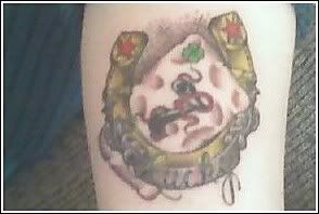
This is a lucky horseshoe, a banner, and _______
swiss cheese? a sponge? I have no idea. What do you think?
I think this tattoo is of an spray paint can but I have no idea what else is going on.
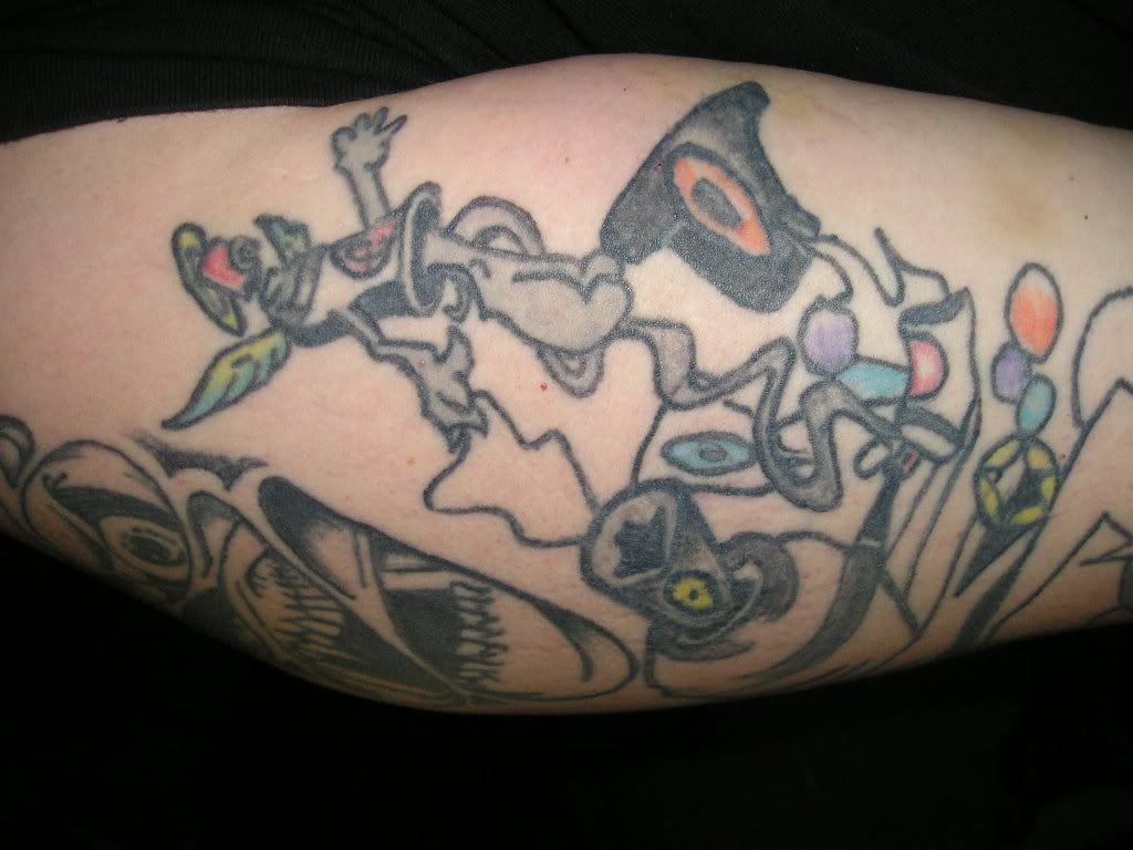
swiss cheese? a sponge? I have no idea. What do you think?

I think this tattoo is of an spray paint can but I have no idea what else is going on.

Monday, July 23, 2007
Oh, The Horror!
Horror tattoos, in one form or another...
First, the amazing back pieces:
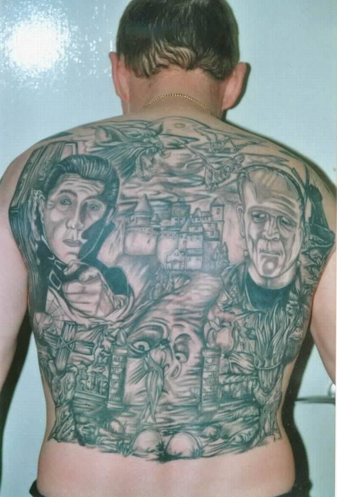
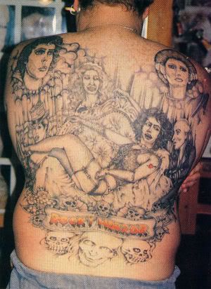
And second, the bad guys.
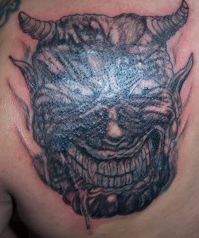
The shine on this one makes it hard to see, but to me it looks like a big blob of cow manure with teeth and horns attached to it.
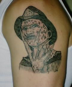
Look at the shading in the hat. It's sooo scratched and uneven. And the skin is supposed to look messed up, but not like there are a million triangles glued to his face.
First, the amazing back pieces:


And second, the bad guys.
The shine on this one makes it hard to see, but to me it looks like a big blob of cow manure with teeth and horns attached to it.

Look at the shading in the hat. It's sooo scratched and uneven. And the skin is supposed to look messed up, but not like there are a million triangles glued to his face.

Subscribe to:
Comments (Atom)


